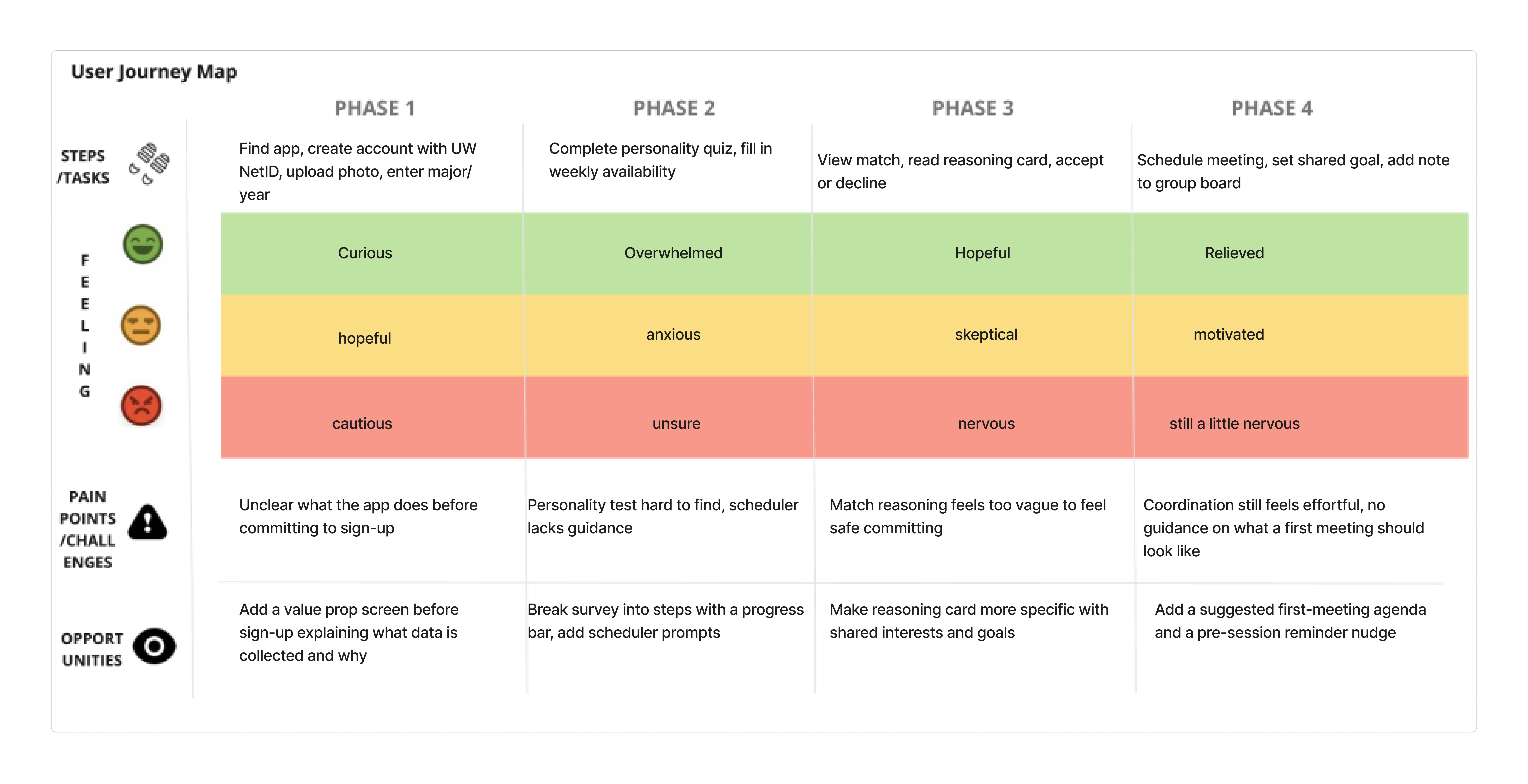
How We Evaluated the Design
Think-aloud usability testing, Wizard of Oz prototyping, and Nielsen heuristic evaluation.
Methods
Testing approach
We used think-aloud usability testing combined with a Wizard of Oz approach for the AI matching component. Because the matching algorithm was not fully built at prototype stage, a team member manually simulated match results behind the scenes while participants interacted with the interface as if it were live. Participants narrated their thoughts, hesitations, and expectations in real time.
Recruitment
We recruited 5 to 8 UW undergraduate students across a mix of class standings, majors, and self-reported social confidence levels. Recruitment prioritized students who identify as introverted or socially anxious. At least two participants were freshman students with limited existing campus connections.
Participants & Tasks
| Method | Participants | Tasks / Focus |
|---|---|---|
| Interviews (research) | 3 freshman students | Open-ended questions on study habits, group formation, compatibility |
| Survey (research) | 10 students (fraternity GroupMe) | Rank compatibility factors; rate struggles finding groups |
| Usability Test 1 | Testing Group #7 (Everwell) | Account creation, profile setup, personality test, schedule setup |
| Usability Test 2 | Testing Group #1 | Same onboarding flow with revised prototype |
Task scenarios
- Complete the onboarding survey and set privacy preferences
- Review your first match and decide whether to accept or decline
- Read the match reasoning card and explain why you think you were paired
- Schedule a first session with your matched group using the in-app scheduler
- Set a shared goal with your group before your first meeting
- Find and add a note to the group board
Test goals
- Determine whether the match reasoning card gives students enough information to feel safe committing
- Identify points in the onboarding flow where students hesitate, drop off, or feel the privacy ask is too large
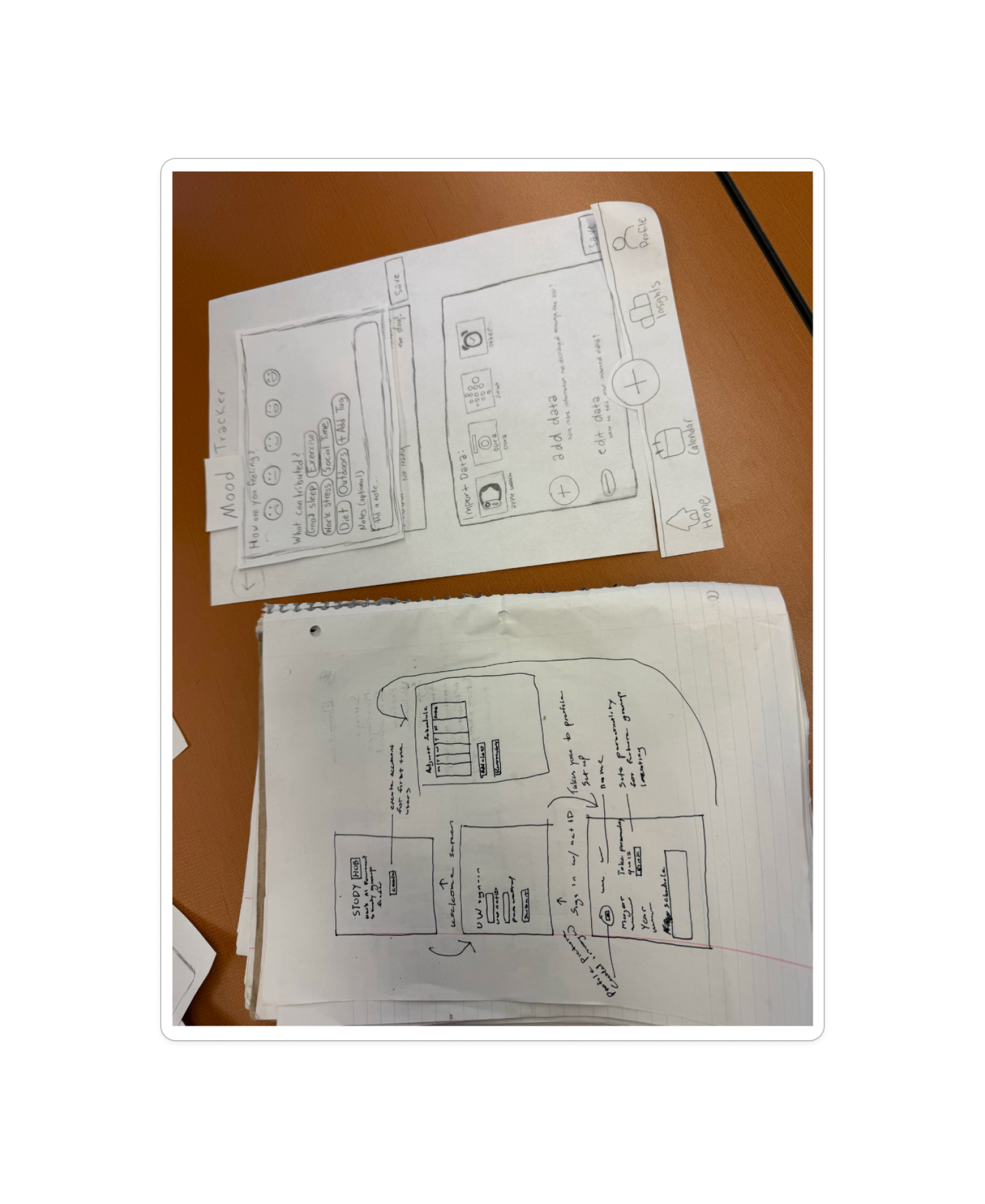
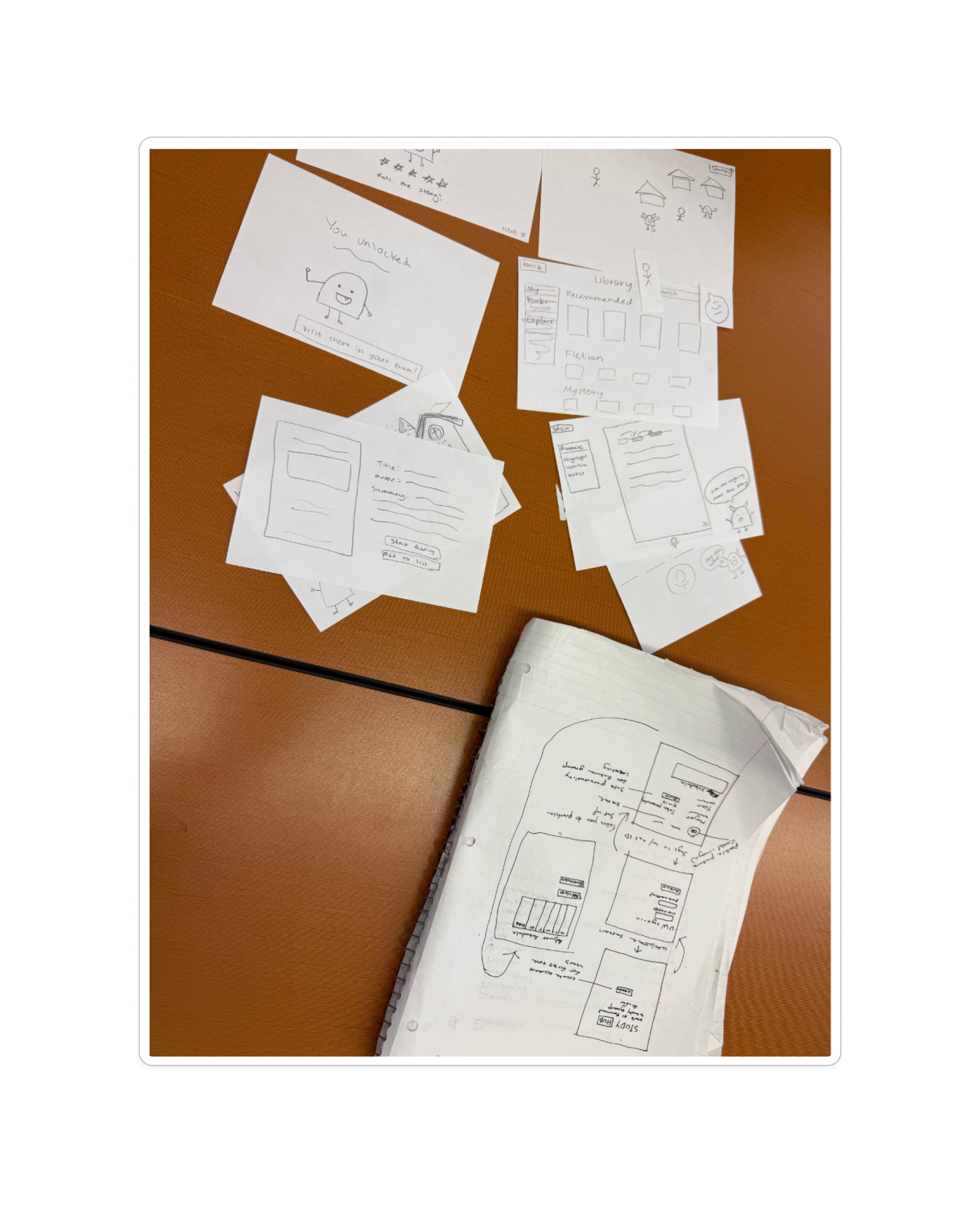
Usability Test 1 · Results
Evaluators: Testing Group #7 (Everwell). UW undergraduates matching our target profile, with at least one freshman with limited campus connections.
What worked well
Account creation flow: Entering UW NetID credentials and submitting the form was completed without significant hesitation. Participants understood the general purpose of the onboarding sequence and moved through early screens with reasonable confidence.
Problems users experienced
Personality test discoverability: Users had difficulty locating the entry point for the personality quiz. The button was not visually prominent enough. Given that the personality survey is the foundation of the entire matching system, this was a critical failure point.
Schedule setup friction: Participants struggled with the schedule-filling interface. The page lacked sufficient prompts or guidance, leaving users uncertain about what level of detail was expected. Socially anxious users are unlikely to push through ambiguous interfaces on their own.
Usability Test 2 · Results
Evaluators: Testing Group #1. Same prototype methodology with a different participant set for cross-validation.
Schedule confusion persisted: Consistent with Test 1, participants expressed confusion around how to build out their schedule. This cross-session consistency validates the scheduler as a systemic design gap, not a participant-specific problem.
Missing user-state cover screens: The prototype did not account for returning users or mid-semester re-matchers. Testers noted disorientation when the interface did not match their expected state.
Testing results summary
| Feature / Task | Result | Notes |
|---|---|---|
| Account creation (NetID) | Passed | Completed without hesitation in Test 1 |
| Profile setup | Partial | Early screens clear; later steps need guidance |
| Personality test entry | Failed | Button not prominent enough; critical for matching |
| Schedule setup | Failed | Confirmed across both test rounds |
| User state management | Partial | No differentiated screens for returning/re-match users |
Expert and Peer Feedback
Throughout the project, classmates and course peers reviewed our prototype and process. Feedback highlighted the need for more visible buttons, simpler navigation, less cluttered pages, and a more intuitive user flow. This expert and peer input complemented formal usability sessions and informed iterations between Test 1 and Test 2.
Nielsen Heuristic Evaluation
| Heuristic | What works well | Issues | Improvements |
|---|---|---|---|
| 1. Visibility of system status | Navigation bar and page titles help users know where they are | Limited feedback after actions; active page not always obvious | Add confirmation messages, loading indicators, highlight active nav |
| 2. Match with real world | Familiar terms like "Groups," "Messages," "Calendar" | Some icons and preference options unclear to first-time users | Add labels/tooltips for icons |
| 3. User control & freedom | Bottom navigation allows free movement; some back buttons | Some pages lack cancel/exit; users may lose progress | Add Cancel, Back, and Save Draft options |
| 4. Consistency & standards | Consistent purple palette and similar UI components | Minor inconsistencies in spacing, alignment, button sizing | Standardize spacing, typography, icon styles |
| 5. Error prevention | Step-by-step onboarding; selectable options reduce invalid input | No visible form validation or required field indicators | Add input validation and mark required fields |
| 6. Recognition over recall | Persistent navigation; group cards visually displayed | Some icons rely too much on memory | Add labels beneath icons and onboarding hints |
| 7. Flexibility & efficiency | Quick access to major features; search supports browsing | Frequent actions require multiple taps; no shortcuts | Add quick actions and customizable dashboard |
| 8. Aesthetic & minimalist design | Clean, modern, visually cohesive interface | Some screens have too much empty space or low text contrast | Improve readability, contrast, visual hierarchy |
| 9. Error recovery | Simple structure reduces major navigation confusion | Error messages and recovery guidance missing | Add clear error messages and recovery suggestions |
| 10. Help & documentation | Onboarding introduces the app's purpose effectively | No visible FAQ, tutorial, or help section | Add Help Center, FAQs, and walkthrough tutorials |
What We Learned
- The onboarding flow is functional at a structural level but relies too heavily on user initiative at two critical junctures: the personality test entry and schedule setup. Confused or hesitant users are likely to disengage rather than troubleshoot.
- The scheduler is the platform's highest-friction point between matching and actually meeting, as confirmed consistently across both test rounds.
- New users, returning users, and re-matchers have meaningfully different needs. Tailored entry screens for each state are not cosmetic; they determine whether users land in the right context or feel disoriented.
- Proposed changes (a more prominent personality test button, scheduling prompts, expanded scheduler functionality, and user-state cover screens) are directly motivated by observed behavior, not assumption.